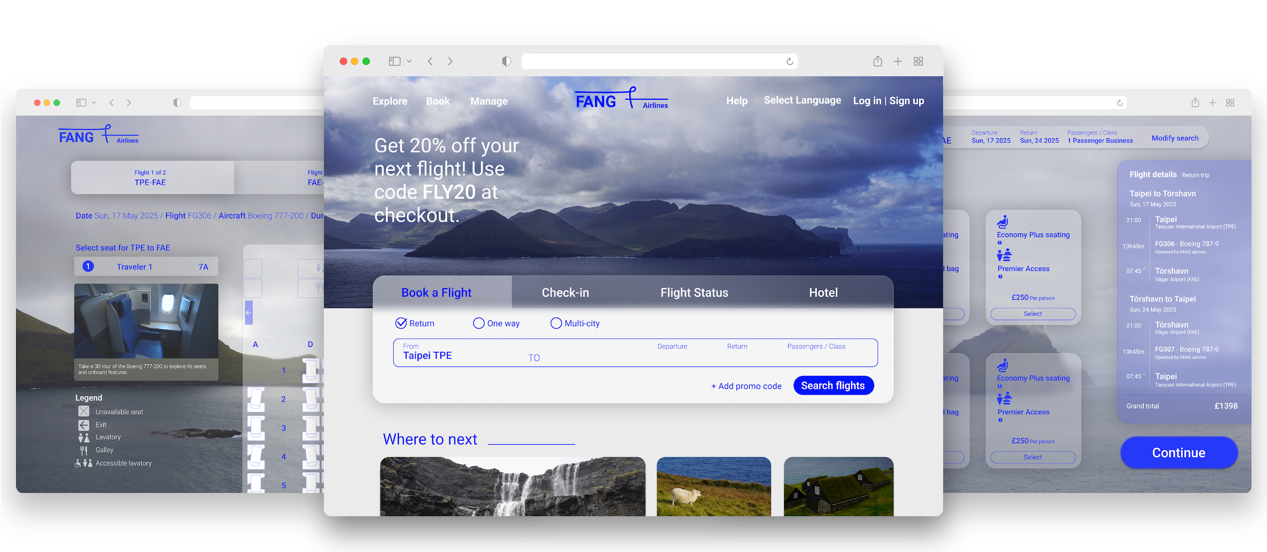
Flight Booking Experience Project
Guiding users through a route of clarity, ease, and trust

Challenge

As flight booking becomes increasingly digitised, users are often left navigating complex, high-stakes decisions with limited clarity.

Between fluctuating prices, unfamiliar fee structures, and dense interfaces, booking a flight can feel more like risk management than planning a journey.

This project set out to explore those frictions and ultimately design a booking flow that feels seamless, empowering, and trustworthy from start to finish.

Research

To explore what makes flight booking frustrating, I assessed 7 airline websites, surveyed 50 users, and conducted usability tests.

The findings revealed recurring friction points:
Misleading pricing — he homepage highlighted the lowest fare, but switching to the chosen travel date revealed higher prices tied to different days, creating confusion and disappointment.
Hidden fees — add-on charges appeared only at later stages, making users feel misled.
Disjointed navigation — users often had to backtrack across multiple pages to confirm flight and cost details.

While most users eventually completed their bookings, many did so with hesitation and reduced trust, signalling deeper gaps in clarity and confidence.

Analysis

I synthesised the findings through an affinity diagram and customer journey map, aligning behavioural feedback with booking stages.
Key insights included:
Pricing and upsell pages triggered the highest hesitation, with users second-guessing whether totals were accurate.
Seat selection and add-on services created emotional drop-off due to inconsistent layouts and last-minute cost increases.

These patterns defined where design needed to restore trust, streamline flows, and provide transparency, laying the foundation for design interventions.

“You cannot understand good design if you do not understand people; design is made for people.”Deter Rams, industrial designer

Design

Research insights drove three key design decisions:

Persistent booking context — flight details and fare remained visible in a right-hand summary panel from fare selection through checkout, reassuring users they were always on the correct flight and price.

Clearer prioritisation of key information — enlarged typography for fares and departure times highlighted the details passengers cared about most, reducing misclicks and uncertainty.

Final confirmation step — before payment, users encountered one last review screen to verify flight details and costs, easing hesitation about moving into the payment stage.

Each intervention directly addressed specific friction points from research, transforming hesitation into confidence through strategic information architecture and visual hierarchy.

Prototyping

The interactive prototype demonstrates these design principles across 7 key screens, from search results through final payment. Notable features include the persistent flight details panel and contextual micro-interactions that guide users through complex decisions. Built to mirror real booking scenarios, the prototype validates how strategic design choices collectively create a more trustworthy experience.

Evaluative Testing

Instructor feedback on the high-fidelity prototype

Feedback
Rationale
Edit
Notes
Departure/arrival fields auto-filled without user input
Reduces realism; users expect to type and see suggestions
YES
Simulate typed input for realism
Date selection happens too fast
Lacks feedback; increases the chance of selection errors
YES
Extend interaction delay
Passenger age info lacks clarity
Poor contrast and small text affect accessibility
YES
Increase font size and contrast
Minus icon hard to see
Low visibility impacts usability
YES
improve icon contrast
Fare info lacks visual hierarchy
Uniform text colour makes scanning difficult
YES
Use colour to differentiate content
Fare section aopears cut off
May confuse users; the scroll is not obvious
NO
Review scroll behavior and layout
Flight week view hard to read
Transparency and small text reduce legibility
YES
Adjust text size or background
Placeholder text unreadable
Redundant with label and lacks contrast
YES
Remove or recolour placeholder
Light font on light background
Poor readabilitv in pavment section
YES
Increase text-backaround contrast

Outcome

The final design reflects a synthesis of user insights, interaction principles, and visual clarity.
Below are selected high-fidelity screens and annotations that demonstrate the core functionality and design intent.

Reflections

Designing for airlines taught me to prioritise clarity under pressure. Next time, I’d focus more on accessibility and error resilience.

More projects

Lorem ipsum dolor sit amet, consectetur adipiscing elit. Suspendisse varius enim in eros elementum tristique. Duis cursus, mi quis viverra ornare, eros dolor interdum nulla, ut commodo diam libero vitae erat. Aenean faucibus nibh et justo cursus id rutrum lorem imperdiet. Nunc ut sem vitae risus tristique posuere.

Email
albert870306@gmail.com
Phone
(+44) 7471117806  /  (+886) 975966337
LinkedIn